Smart use of colors is one of the key tools when it comes to looking fashionable while flattering your figure. A wise color combination can indeed make the most of your assets, enhancing your body type and making your silhouette look more proportional.
.
The easiest approach to colors usually consists in picking out a base hue, then pairing it to one or more of its countless nuances and variations. This approach to color combination, though, can be quite tricky, as a slight variation in tone can indeed completely change a given tonality and make it unsuitable for certain pairings.
Furthermore, not everyone knows that the perception of a specific hue may completely change depending on the other surrounding colors. The example in the image below makes it crystal clear: the two small squares look different, but they are exactly the same shade!
.

The perception of colors depends on the other surrounding hues. The two small squares look different, but they are exactly the same shade!
To play it safe, one of the easiest ways is making extensive use of neutral colors (which, among other things, is totally fashionable this season, meaning that the options are nearly endless).
As already encountered when talking about the tricks to flatter your figure with jeans, neutral colors will give you the opportunity to really go wild with an infinite possibility of choices, allowing to get impeccable and unique outfits that go with anything and are suitable for countless places and settings.
Also, they allow you to play it safe when picking out fancy garments, as they guarantee a chic and classy outfit even with unusual styles or elaborate details.
.
To better explain how to identify neutral tonalities – and then how tones can be combined together – it may be useful to spend a bit of time focusing on the technical meaning of the so-called “neutrals”.
.
This may be understood with some ease referring to the HSV model (a system used for identifying colors). HSV stands for Hue, Saturation, and Value, where (1) Hue indicates the “pure color” being referenced (red, yellow, blue, and so on), (2) Saturation refers to how much white has been added to the base color (if there is devoid of white, the color is pure, whereas if white is gradually added, then the color becomes fainter producing the so-called pastel colors), and (3) Value, or brightness, which points to the amount of black or grey added to the color.
This last feature (the amount of black or grey added to a hue) is precisely what allows to clearly identify neutral shades: that is, tonalities where the original color is somehow toned down.
.
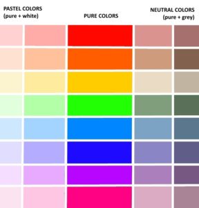
A neutral hue is obtained by adding black or gray to any pure color
Interestingly enough, as you can see in the picture above, the most harmonious pairings are not those on the same horizontal line (which represent variations in lightness and darkness of the same tone): pairing bright green to pale green would not be the most flattering choice.
Conversely, neutral colors allow the chicest and most elegant combinations ever. With these hues, the original tone is attenuated and no longer easily recognizable so they can easily match with any other tone.
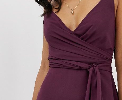
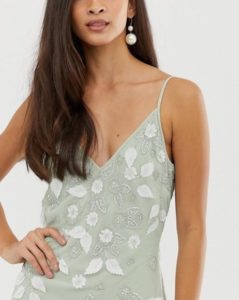
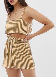
As you may see looking at the pictures of this post, neutrals do not only include pale, faint colors, but also intense tints which, thanks to the addition of black (or gray) achieve a stunning matching potential both with other shades as well as with your colors.
.
Even with intense tints like red, bright green, or lemon yellow, a touch of gray is all you need to add to bring about a deep, proper transformation of the base tone—more flexible, and phenomenally more disposed to being paired with other colors.
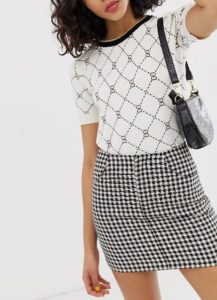
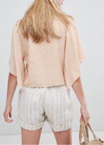
Neutral colors also allow to play it safe when matching different patterns, as the image below clearly shows.
.
Furthermore, neutral tonalities guarantee the best results when it comes to flattering your figure, as they allow a sophisticated outcome that plays down any imperfection while elongating your figure.
.
In the next post, we’ll see the main tricks to get the most of these tonalities achieving chic and fashionable results.
.
